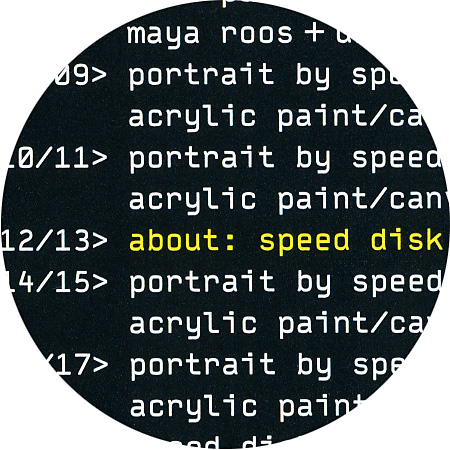
Typestar, detail from “Portraits by Speed Disk”
May 7th, 2003
Typestar
Typestar by Steffen Sauerteig (*1967).
Together with Kai Vermehr and Svend Smital, Steffen is running the design label eBoy.
Typestar, detail from “Portraits by Speed Disk”
Typestar by Steffen Sauerteig (*1967).
Together with Kai Vermehr and Svend Smital, Steffen is running the design label eBoy.
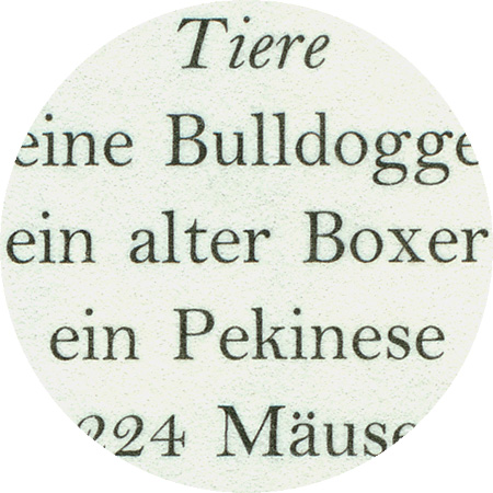
Bell Antiqua, detail from «Meike Dölp – Vom Wolkigen»
The Bell antiqua is named after the English caster, printer, bookseller, publisher and journalist John Browne Bell (1745–1831). In 1766, he acquired the British Library, which became one of the most important lending libraries in London. The pages of his newspaper The Oracle were influential for many periodicals that followed. John Bell also founded the first illustrated fashion magazine in England La Belle Assemblée (a play on words on his own name). In 1788, he founded the British Letter Foundry with Richard Austin as punch cutter and engraver, to whom the Bell antiqua owes its appearance. It was considered a font innovation from the very beginning and was the first font in England from which the long “s” was banished.
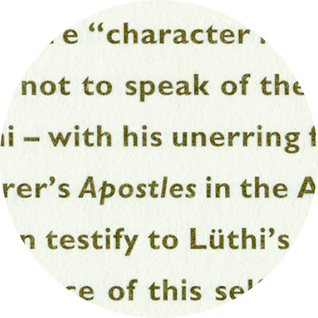
Gill Sans, detail from «Urs Lüthi – Art For A Better Life»
Gill Sans is a sans-serif linear antiqua font that was designed by Eric Gill (1882–1940) between 1928 and 1930. Gill Sans is based on Edward Johnstons’ font type Johnston Sans, which was co-designed by Gill. One characteristic is that the different font styles do not build on each other systematically, but have their own respective character. Italic fonts are only available in the font styles light and regular and some letters have a shape similar to handwriting, as is the case with the italics in antiqua fonts.
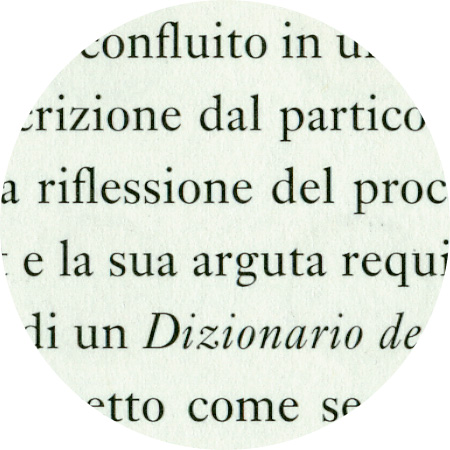
Ehrhardt, detail from «Urs Lüthi – Art For A Better Life»
The name Ehrhardt refers to the fact that this font derives from the normal and italic fonts of the leisurely Dutch styles that were contained in the Ehrhardt foundry’s type specimen book in Leipzig in the late 17th century. The font designer remains anonymous although some historians suspect it was the Hungarian punch-cutter Miklós Kis (1650–1702). Monotype recut Ehrhardt in the years 1937 until 1938.