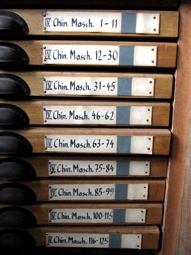
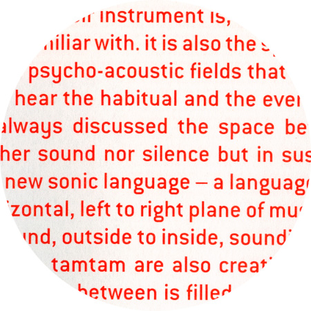
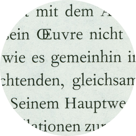
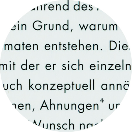
Ludwig, designed 2008 by Fred Smeijers. It belongs to the group of sanserif types known as 'grotesque', a name introduced in the 1830s when sanserifs began appearing regularly as printing types. Sanserifs were in general seen as blunt and inelegant, hence names like grotesque. It was the German typefounders who first produced sanserifs in sizes suitable for text, with fully matching upper and lowercase designs. OurType Ludwig is based on these first German sanserifs. But it is not a mere revival. It embodies Smeijers personal vision of how a early 19th-century sanserif design might look and perform today.
The basic model for Minion did not come from any one single source, but was a synthesis of historical forms and the digital possibilities of the 1980s. In the course of his research for the Adobe Garamond, Robert Slimbach collected a wealth of material on Renaissance typefaces from European museums. When Adobe began planning a new body text font, he brought the material out of his archive and gathered together all the usable ideas so that he could put a first draft down on paper. Adobe had just invented its Multiple Master technology, which enabled font users to generate custom fonts themselves without the need for drawing tools. Slimbach succeeded, using as few interpolation points as possible, in constructing the Minion characters. Minion Pro is an OpenType update of the original family, released in 2000.
Monotype Grotesque, detail from “Special Models”
Monotype Grotesque, detail from “Jakob Bill – Painting”
Monotype Grotesque, detail from “Dieter Roth – Tränenmeer”
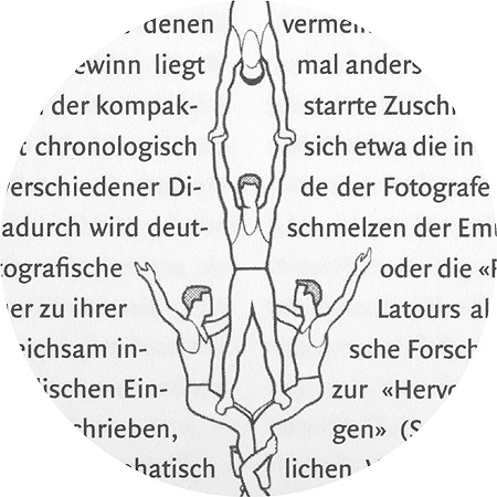
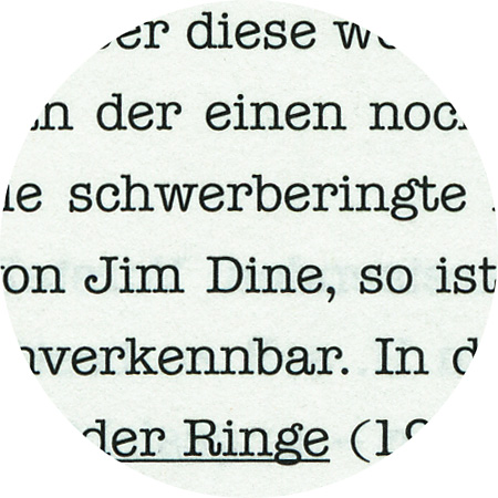
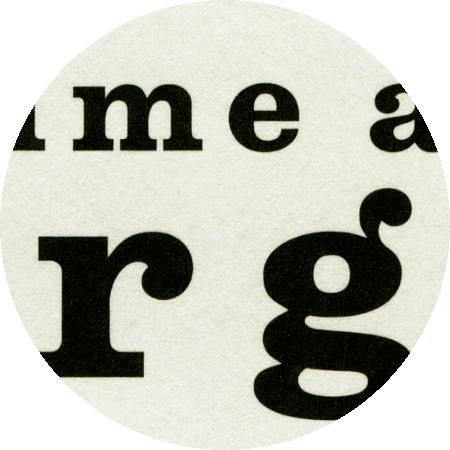
Monotype Grotesque, designed by Frank Hinman Pierpont (1860–1937) and published in 1926. The French term grotesque is etymologically derived from the Italian grottesco, which actually means “cave dwelling”. This referred to ancient paintings, characters and engravings that were discovered in caves and buried holes. Sans-serif fonts have been called Grotesk in Germany up until now. Monotype Grotesque is among the earliest sans-serifs cut for hot-metal machine typesetting, which was gaining widespread use in England in the 1960s. The typeface became popular in the 1950s and 60s owing to its availability on Monotype machines.
Folio is a realist sans-serif typeface designed by Konrad Bauer and Walter Baum in 1956. Like Helvetica and Univers, which were also released around that time, it is part of the International Typographic Style and modeled after Breite Grotesk from 1867.
Quadraat sans, detail from “KWI Report”
Quadraat sans, detail from “Zeitschrift für Medienwissenschaft”
Quadraat sans, detail from “Höhenrausch”
Quadraat sans by Fred Smeijers, who established the design group Quadraat (in Arnhem). The name was also given to his first published typeface: FF Quadraat, launched in 1992. In 2004 Smeijers was appointed Professor of Digital Typography at the Hochschule für Grafik und Buchkunst, Leipzig.
The original Helvetica design was created by Max Miedinger and released by Linotype in 1957. The second, Neue Helvetica, was a re-working of the 1957 design and was released in 1983 by D. Stempel AG. More recently, Linotype released the Neue Helvetica Pro design in 2004, which is an OpenType version with expanded foreign language support.
Dada Grotesk, detail from “Klaus Lutz - Im Universum”
Dada Grotesk was designed by Alexandre Dimos and Gaël Etienne (Studio deValence, Paris) for the book and the signage of the DADA exhibition at the Centre Pompidou in Paris, 2005. The font is based on a typeface found in a 1918 issue from the Dada Paris magazine, originally called Aurora.
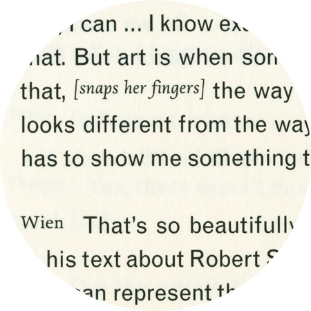
Swift, designed 1985 by the dutch type designer Gerard Ungers (*1942), has proved its worth in corporate identities, magazines and newspapers and occasionally in books – it is a versatile type and can be used in a wide range of circumstances. It is a striking type, with large serifs, large counters and letters that produce a particularly strong horizontal impression. This means that words and lines in Swift are easily distinguished, even where there are large spaces between words, as can occur in newsprint.

Nobel, detail from “Ilze Orinska – Labor Manuum”
DTL Nobel. Sjoerd Hendrik de Roos (1877–1962) is considered to be Holland’s first professional type designer. His typeface Nobel was created in 1929 for the Amsterdam Type Foundry as a response to Futura and Berthold Grotesk. It was successful throughout the country and was used in many Dutch mechanical typesetting companies until the 1960s. Using the historical type specimen by de Roos, Andrea Fuchs and Fred Smeijers created DTL Nobel for the Dutch Type Library in the years 1990–93. The Nobel series was also designed for Font Bureau by Tobias Frere-Jones. The Extra Lights were added by Cyrus Highsmith & Dyana Weissman.
Docmenta Sans, details from “Eugen Schönebeck”
DTL Documenta Sans designed 1986–1993 by Frank E. Blokland (* 1959). Type designer and Senior Lecturer at the Royal Academy of Art in The Hague, Frank E. Blokland founded the Dutch Type Library in 1990, the first producer and publisher of digital typefaces in the Netherlands.
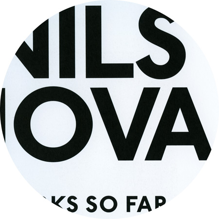
Johnston Sans, detail from «Nils Nova – Works so far»
ITC Johnston finds its roots in Edward Johnston’s early 1900 London Underground Railway typeface, and there were no italics for his original design. Johnston’s London Underground Railway typeface was the first alphabet created for a specific corporate identity and the first sans serif design of the twentieth century. Edward Johnston himself, however, never called his design a typeface. It was an alphabet primarily for signage and other display purposes – designed to be legible at a glance rather than readable in passages of text.
Caxton, detail from “Nils Nova – Works so far”
Caxton, designed by the late Leslie Usherwood (1932–1983) in 1981 for Letraset, is an old style design with a large x-height, short serifs, and high-waisted capitals. The font is named after William Caxton (1422–1491) who produced and printed the first book in the English language (The Game and Play of Chess Moralised, 1476, a translation of the first major European work on chess).
Vendetta, designed by John Downer (*1951) for Emigre (released 1999) is a revival of the general Venetian Old Style class of types. Tribute is not paid to one individuell punch-cutter or to a single printing type, but rather to a definite historical structure. John Downer began training as a sign painter while he was in high school. His essays on type history and hand lettering have appeared in Emigre magazine and House magazine.
Plak, detail from “Press Art”
Plak, designed by Paul Renner in 1928. Renner ( designed a grotesk bearing some similarity to Futura as a display typeface for Stempel. Plak was produced as wooden letters from 72 point to 624 point in size. Being a poster type, it was available exclusively in bold weights, but in three width variations. German typographer Paul Renner (1978–1956) is best known as the designer of the typeface Futura, which stands as a landmark of modern typographic design.
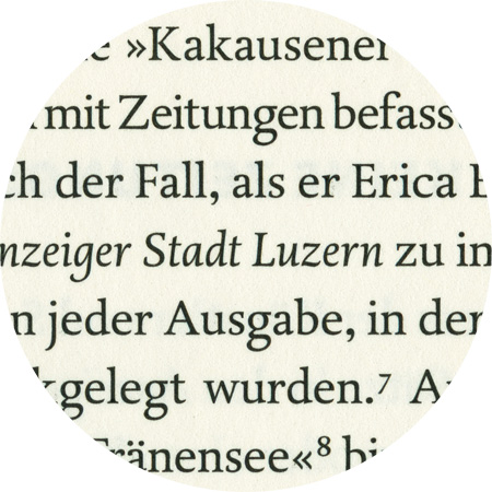
Quadraat, detail from “Dieter Roth, Tears in Lucerne”
Fred Smeijers’ (* 1961) Quadraat offers a crisp interpretation of typographic tradition. Originally designed around 1992 for his own design company with the same name, Quadraat combines Renaissance elegance with modern ideas on construction and form. He followed Antiqua archetypes, but ultimately created an original italic typeface in Quadraat Italic. In 1997, following in the footsteps if his compatriots Jan van Krimpen, Martin Majoor and Lucas de Groot, he added a sans-serif version and later added display and heading variants as well.
Centaur, detail from “Bruce Wrighton - At Home”
Bruce Rogers (1870–1957) originally designed Centaur for the Metropolitan Museum in 1914. The matching italic font, which was designed by Frederic Warde in 1925, was originally called Arrighi because Warde drew these italics based on Ludovico Vicentino degli Arrighi’s italic typeface. The completed typeface was released for general use in 1929 by the Monotype Corporation Ltd.
Bureau Grotesque, detail of “Zeitschrift für Medienwissenschaft”
Bureau Grotesque reintroduces the tooth and character of the nineteenth-century sans. Developed in 1989 for Roger Black, The Tribune Companies, and Newsweek, the first Grotesques met with immediate success. Further weights were designed for Entertainment Weekly and Madrid daily El Sol a family of twelve fonts by 1993. David Berlow found his models in Stephenson Blake grotesques from the 1800s.
Janson text. The models for this font were originally credited to Anton Janson (1620-1687), a German punch-cutter working in Holland. Some font historians dispute this and credit the authorship to Nicholas Kis, a Hungarian punch-cutter. The original Janson antiqua first underwent a transformation into another composition style in the 1950s under Hermann Zapf. In 1985, Adrian Frutiger adapted Janson for Linotype.
Quadraat sans by Fred Smeijers, who established the design group Quadraat (in Arnhem). The name was also given to his first published typeface: FF Quadraat, launched in 1992. In 2004 Smeijers was appointed Professor of Digital Typography at the Hochschule für Grafik und Buchkunst, Leipzig.
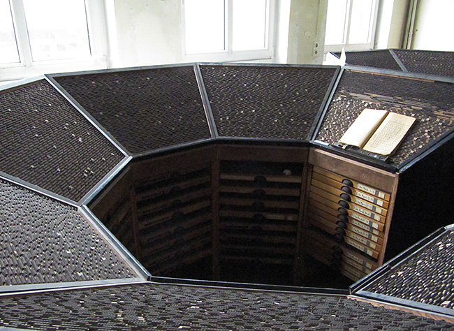
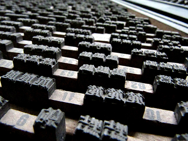
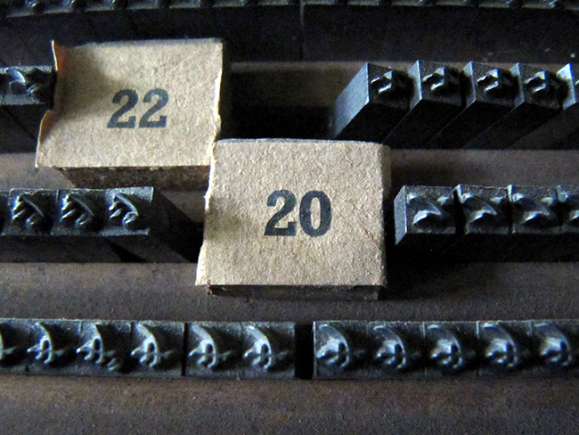
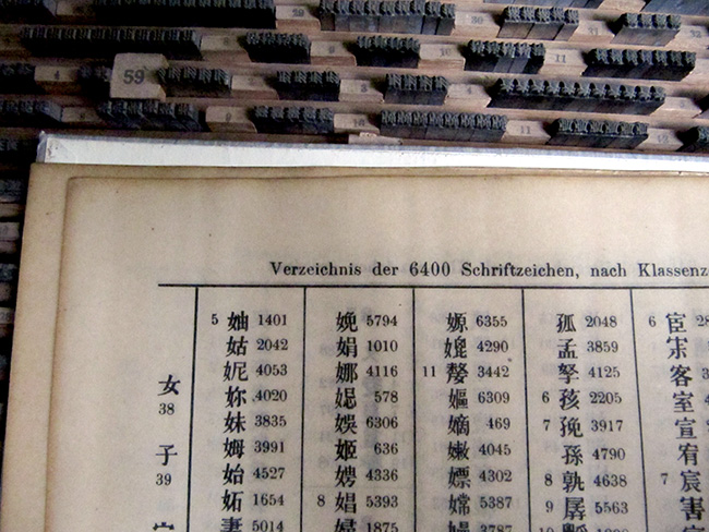
Zeitschrift für Medienwissenschaft
Janson Text, detail from “Zeitschrift für Medienwissenschaft”
Janson Text, detail from “Max Wechsler - Augenzeugnis”
Janson text. The models for this font were originally credited to Anton Janson (1620-1687), a German punch-cutter working in Holland. Some font historians dispute this and credit the authorship to Nicholas Kis, a Hungarian punch-cutter. The original Janson antiqua first underwent a transformation into another composition style in the 1950s under Hermann Zapf. In 1985, Adrian Frutiger adapted Janson for Linotype.
Oranda, detail from “Celluloid”
Oranda was designed by the Dutch designer Gerard Unger as a custom project for the European printer manufacturer Océ, in 1987. “When I designed Oranda I had a look at typewriter fonts and came up with a subtler and more modern variant: narrower, more open, with tapered serifs and proportional spacing.” (G. Unger)
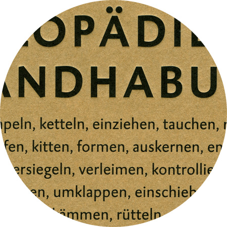
Caspari, detail cover of «Annette Rose – Enyklopädie …»
Caspari, detail from “What Is a Good Exhibition”
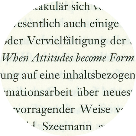
Caspari was started by Gerard Daniëls (* 1966) while he was still studying at the “Koninklijke Academie van Beeldende Kunsten” in the Hague, Netherlands. It was released in 1993 through Dutch Type Library. Caspari can be situated somewhere halfway between Gill Sans and Syntax, but its openess and simplicity lend it a typically Dutch quality. It also has beautifully shaped oldstyle figures and powerful real italics, which most sanserifs lacked at the time.
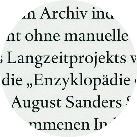
Haarlemmer, detail from «Annette Rose – Enzyklopädie…»
The “Vereeniging voor Druk- en Boekkunst” (Society for the Art of Printing & Books) invited Dutch type designer Jan van Krimpen (1892–1952) to design a new typeface for an edition of the Dutch Authorized Version of the Bible (Staten Bijbel) in 1938. The first trial sheets of Haarlemmer were pulled in June 1938. Further work on the design was done at the Monotype works in England during the early months of the war, but all plans for the Staten Bijbel were abandoned after the invasion of Holland. 60 years later, the Haarlemmer contours were subsequently given a face-lift by Frank E. Blokland (* 1959). The roman was revised especially thoroughly. Apart from weight and contrast, form and adjustment were considerably improved. The true qualities of the 1938 type design, which technical limitations and war had prevented from completion, are revealed now in DTL Haarlemmer.
Garamond CE, detail from “Ilze Orinska – Naturalia”

Stempel Garamond, detail from “Rémy Markowitsch – Bibliotherapy”
Latvian, set in Garamond CE.
Latvian is one of two living Baltic languages with an official status (the other being Lithuanian), a group of its own within the Indo-European language family.
Latvian in western orthography was first written using a system based upon German phonetic principles, while the Latgalian dialect was written using Polish orthographic principles. At the beginning of the 20th century, this was replaced by a more phonetically appropriate system, using a modified Latin alphabet.
Akzidenz Grotesk, details from «space–thinks»
“Accidenz” (sic) Grotesk was released by Berthold in Berlin in 1898, according to their own literature. It was obviously based on faces already offered by other foundries, some of which were later taken over by Berthold. One of the contemporaries of AG was Royal Grotesk from Theinhardt. In Berthold's specimen booklet no. 429, which was most likely released in 1954, Akzidenz Grotesk Mager (light) was still referred to as Royal Grotesk, in brackets. Berthold acquired a typeface in 1908, (when they bought Ferd. Theinhardt) which they released as space–thinks
Skopex Serif and Gothic, detail from “Nezaket Ekici”
Skopex Gothic, detail from “Nezaket Ekici”
Skopex Gothic, detail from “Labyrinth–Freiheit”
Skopex Serif, detail from “Labyrinth–Freiheit”
Skopex designed by Andrea Tinnes is an extensive font family consisting of a gothic and a serif variant. Skopex Serif is a contemporary serifed typeface with a strong vertical nature and many playfull details. Skopex Serif matches the proportions of its gothic sister but has a strong contrast between thick and thin strokes. Characteristic features are the asymmetrical serifs as well as the slightly curved terminal strokes of R, K, k and y. The name “Skopex” comes from the ancient Greek verb skopein (see, view, sight, look at, examine) as well as the English noun scope (range, depth, breadth, reach).
Walbaum was originally punchcut by Justus Erich Walbaum (1768–1837) in Weimar around 1800. It ranks with Bodoni and Didot as one of the great European “modern” style typefaces. Modern types represented the ultimate typographic development of the late eighteenth and early nineteenth centuries. They have characteristics quite different from the types that preceded them; such as extreme vertical stress and fine hairlines contrasted by bold main strokes.
Tarzana narrow bold, detail from “Hoehenrausch”
Tarzana Narrow bold, detail from “Hoehenrausch.2”
Tarzana Narrow Bold, designed 1998 by Zuzana Licko (co-founder of Emigre, together with Rudy VanderLans). The two families of sans-serif text faces were developed purely along formal lines. The goal was to balance the neutrality required for a text face with just enough idiosyncrasies to create a slightly unfamiliar design in order to provide new interest.
The 20-year old designer?s son Oswald B. Cooper took Frederic Goudy's writing course, among other things, at the Frank Holme School of Illustration in Chicago. In 1921, he designed a thick font with round serifs, which he published at Barnhart Brothers & Spindler in 1922. Cooper Black corresponded to the advertising spirit of those times: simple, friendly, powerful. It was so successful that Monotype ordered a copy, which was created by Cooper's teacher Goudy and released as Goudy Heavyface in 1925.
DTL Fleischmann, detail from «Britta Lumer»
DTL Fleischmann was designed between 1993 and 1997 by the Leipzig-based font developer Erhard Kaiser (*1957) on commission by the Dutch Type Library. It is a new interpretation of a Barock-Antiqua and is based on historical font styles developed by by the punch-cutter Johann Michael Fleischmann (1707?1768) in the Netherlands in the second third of the 18th century.
Helvetica Bold condensed, detail from «Nils Nova – Screen»
Helvetica bold (top), Helvetica condensed (bottom)
The first Helvetica styles, which were also used in the exhibition of die stadt von morgen (“the city of tomorrow”) in 1957, were designed by the graphic designer Max Miedinger (1910–1980) in collaboration with Eduard Hoffmann. They used Akzidenz Grotesk by Berthold and Normal Grotesk by the company Haas as models. In 1957, the semi-bold Garnitur was released for the graphics trade fair ’57 for manual typesetting, firstly under the name Nils Nova – Screens
Trump Mediaeval, detail from “die stadt von morgen”
Georg Trump (1896–1985) designed the Trump Mediaeval between 1954 und 1962. It is a fusion of characters from an Italian renaissance antiqua with calligraphic elements.
ITC Conduit was created by Mark van Bronkhorst in 1997 based on “unprofessionally” painted shop signs. The shapes are similar to the perpendicular shapes of pipes, and Bronkhorst has rounded off the corners and edges.
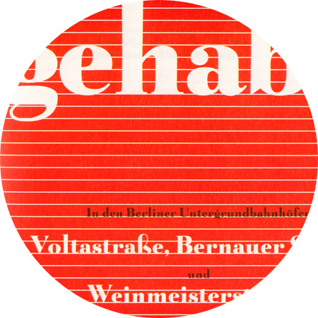
Belucian Ultra, detail from «Glück gehabt»
Belucian Ultra, originally designed as Lucian by Lucian Bernhard (1883–1972) in 1932, later later re-released as Belucian. Lucian Bernhard (born as Emil Kahn) designed posters, type, packaging, textiles, interiors and trademarks for a great many companies over the course of his career and his work was influential in both the United States and Europe; he emigrated from Berlin to America in 1923.
DTL Nobel, detail from «Glück gehabt»
Nobel is a geometric sans-serif typeface designed by Sjoerd Henrik de Roos (1877–1962) and Dick Dooijes (1909–1998) in the period 1929–1935 for the Lettergieterij Amsterdam (Amsterdam Typefoundry). Begun just two years after the release of Futura, Nobel is a similar exploration of geometric form but allows far more biomorphic shapes and variation. It became one of the best selling sans-serif types of the Lettgieterij Amsterdam, continuing in popularity into the mid-1960s. Andrea Fuchs and Fred Smeijers of the Dutch Type Library produced a revival in 1993.
Gothic No. 13, assumedly designed 1942 by Robert Hunter Middleton (1898-1985)
In 1924, Monotype based this face on types cut byPierre Simon Fournier circa 1742 and called “St Augustin Ordinaire” in Fournier’s “Manuel Typographique”. These types were some of the most influential designs of the eighteenth century, being among the earliest of the transitional style of typeface, and were a stepping stone to the more severe modern style made popular by Bodoni later in the century. They had more vertical stress than the old style types, greater contrast between thick and thin strokes and little or no bracketing on the serifs.
Centaur, detail from “Robin Rhode – Walk Off”
Centaur, originally designed by Bruce Rogers and Frederic Warde, 1914/1925). Bruce Rogers originally designed Centaur for the Metropolitan Museum in 1914. The italic font, which was later added by Frederic Warde in 1925, was originally called Arrighi. He drew these italics based on Ludovico Vicentino's Italika from the first half of the 16th century. The majuscules were designed from scratch.
Baskerville, detail from «Schaurausch»
Baskerville, which was originally developed by John Baskerville (1706–1775), was a technical milestone and an important reference for later classicists. Despite this, Caslon was often preferred at the time for aesthetic reasons, which is also recognised as the “English Antiqua” par excellence. There were already innumerable versions of Baskerville at the time of metal type.
Knightsbridge, detail from «Schaurausch»
Knightsbridge, a robust and bold italic font, was created by Alan Meeks in 1975. This is a completely new interpretation of the alphabet that does not derive from any typographic or historical sources.
Tyfa, detail from “Josephine Troller”
Tyfa, detail from “Bittermann & Duka”
Tyfa was designed as a hot type font in 1959 by Josef Týfa (1913–2007), who had a decisive influence on Czech corporate design in the 50s and 60s. From the mid-60s, he taught himself to design fonts. He named the Czech graphic designer Jaroslav Benda, modern graphic design and architecture of Pier Luigi Nervi as the main influences on his work. In 1995 another Czech type designer, Frantisek Storm, approached Tyfa and proposed digitizing the typeface under the elder designer’s direction. Tyfa agreed. To build Tyfa’s design into a family of digital fonts, Storm started with scanned images of the original drawings for metal type. Maintaining the personality and basic characteristics of the metal original was a primary objective for the two designers.
In designing Goudy Sans, Frederic W. Goudy (1865–1947) studied old lapidarian fonts and manuscripts. The font has these sources to thank for some of it special features: crescendo endings, accentuated serifs on some of the majuscules and alternative Unzial shapes. The first three cuts appeared in 1929.
Centennial, detail from «Don’t Worry, Be Curious!»
Linotype Centennial was designed by Adrian Frutiger and released in 1986 for the celebration of Linotype’s 100th anniversary. Frutiger was influenced by Century, a type designed by Linn Boyd Benton (1844–1932) and his son Morris F. Benton (1872–1948) for the American Type Founders Company at the end of the nineteenth century. Linotype Centennial is quite close in concept to Century, but it also has the characteristic Frutiger enhancements for contemporary elegance and legibility. It has a vertical stress, slightly condensed forms, a tall x-height, and fairly high contrast between thick and thin strokes.
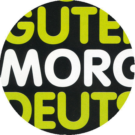
American Typewriter, detail from “Die Ringe des Dieter Roth”
American Typewriter, Detail from “Nic Hess – Guten Morgen Deutschland!”
Mechanical typewriters insert the same spacing in between all letters (monospaced). In contrast, the American Typewriter created by Joel Kadan in 1974 and commissioned by ITC has proportional spaces. It is a new interpretation of older mechanical typewriter models.
Incidentally, Mark Twain is said to have been the first to compose a complete manuscript on a typewriter: “The Adventures of Tom Sawyer” (the first edition appeared in 1876).
Univers Condensed, detail from «Paolo Parisi»
Univers is a sans-serif linear antiqua font, which was designed in 1950/1951 to 1956 by Adrian Frutiger and published by the type foundry Deberny & Peignot in 1957. Helvetica and Univers are probably among the most commonly used font types in so-called Swiss typography. Different thicknesses and character widths within the font family, which is made up of a total of 21 (later 27) font styles, are identified through a numbering system instead of by names. This is a system that Frutiger also later used for other font types.
Plantin, Detail from “Paolo Parisi – Observatory”
Plantin, Detail aus «Special Models»
Plantin was designed 1913 by Fritz Stelzer under the guidance of Frank Hinman Pierpont (1860–1937) for the Monotype Corporation. Pierpont is said to have been inspired to create the Plantin font by the font of a 1905 catalogue from the Plantin Moretus Museum. The name of the font refers to the publisher and printer from Antwerp, Christophe Plantin (1520–1598), who used it in 2450 publications over 34 years. Plantin is among the fonts that were created during the course of the neo-renaissance movement in Europe and America after the qualities of the renaissance antiqua were re-discovered around the middle of the 19th century. Plantin is one of the typefaces that influenced the creation of Times New Roman in the 1930s.
Beton, Detail from “U2 Alexanderplatz”
Beton, Detail from “Max Wechsler, Augenzeugnis”
Beton Bold Condensed, created in 1931 by Heinrich Jost (1889–1949). Serif linear antiqua fonts first appeared at the beginning of the 19th century. In the 1930s, they belonged to the standard fonts. The first serif linear antiqua fonts were derivatives of text fonts similar to the Didot font (e.g. the Walbaum font). As newspapers and advertising became more and more important, type foundries and printing presses began cutting larger, bolder fonts that attracted the reader’s attention. This self-reinforcing phenomenon finally ended with monstrous letterpress wood types. At the beginning of the 20th century, typographers began taming and codifying the font styles of the 19th century.
Futura, detail from “U2 Alexanderplatz”
Futura, detail from «Nader Ahriman»
The Futura font, of which Paul Renner produced the first designs back in 1924, was strongly inspired by Bauhaus. Renner regarded it as overcoming the “incoherency of Roman tilting font and the Latin lower-case letters, which originated from the handwritten Carolingian Minuscule font”. His Futura font was the prototype for a geometrically-designed sans-serif linear antiqua font.
Lunatix, detail from «Die dritte Kammer»
Lunatix, designed in 1988 by Zuzana Licko (* 1961). As the daughter of a bio-mathematician, she had access to computers from a young age and taught herself the basic principles of programming. She then began to develop her first fonts and her first alphabet was based on the Greek alphabet. She first studied Architecture, Information Technology and Photography and complete a diploma in Visual Communication at the University of California, Berkley. She subsequently collaborated on the development of post-font technology in Adobe Systems’ graphics department. At the beginning of the 80s, Licko founded the experimental type foundry Emigre with the Dutch graphic designer and Photographer Rudy VanderLans (the title was derived from the fact that both were so-called émigrés i.e. immigrants in the USA).
VAG Rounded, Detail from «Nic Hess – Guten Morgen Deutschland!»
VAG Rounded was originally commissioned specifically by Volkswagen in 1978, who at the time had recently merged with Audi to form the “Volkswagen Audi Group” (VAG). GGK Düsseldorf was tasked with the branding concept. Volkswagen at the time had Futura as their typeface. Audi at the time used Times. The new typeface should not be sans serif as the Futura, and it should not be serif as the Times. A rounded typeface did not exist at the time; it had to be developed. The original idea was conceived by Wolf Rogosky (creative director) and Gerd Hiepler (art director). The original typeface was rendered by hand.
Since then, VAG Rounded has seen frequent use including on Apple keyboard products since 2007. In March 2015, Apple marked its first departure from VAG Rounded as a standard for its keyboards by using its own San Francisco typeface on their new MacBook models.
Goudy Catalogue, detail from «Nic Hess – 51 Views of Mount Matterhorn»
Goudy Catalogue (Frederic W. Goudy, 1915). Frederic William Goudy (1865–1947) became familiar with William Morris' books and the press movement in his early years as a bookseller. In 1903 he founded Village Press. From 1920 to 1940 Goudy was the artistic director of the Lanston Monotype Company. Goudy developed over 100 fonts between 1899 and 1944.
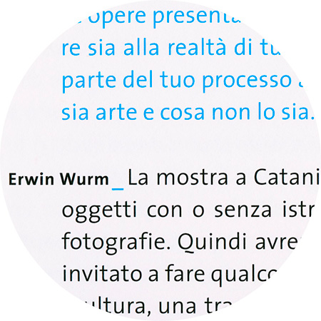
TheSans Regular, detail from “Erwin Wurm – Glue your brain”
TheSans Regular, detail from “Max-Planck-Institute”
Thesis is a font superfamily that is essentially composed of four font variations: TheSans, TheSerif, TheMix and TheAntiqua. The original typesets were developed in 1994 by the Dutch designer Lucas de Groot. Since then, he has added to it with numerous font variations at regular intervals. Meanwhile this gigantic superfamiliy includes Cyrillic, Hebrew and even Arabic variants. Thesis became part of the LucasFonts type library in 2000.
Avenir book by Adrian Frutiger (b. 1928). The design of Avenir can be traced back to two earlier sans-serif fonts, Futura and Erbar, and follows the new sobriety of the thirties. In contrast to Futura it is not constructed, rather is was drawn by Frutiger around by hand and then digitalised (published 1988).
Goudy Old Style, detail from “Rémy Markowitsch – On Travel”
Goudy Old Style (Frederic W. Goudy, 1916). Frederic William Goudy (1865–1947) became familiar with William Morris' books and the press movement in his early years as a bookseller. In 1903 he founded Village Press. From 1920 to 1940 Goudy was the artistic director of the Lanston Monotype Company. Goudy developed over 100 fonts between 1899 and 1944.
David Berlow’s Belizio is based on Aldo Novarese’s Egizio, designed in 1955. It was first prompted by the popularity of Haas Clarendon designed by Hoffmann and Eidenbenz, an impeccably Swiss revival of the traditional English letterform. Aldo Novarese was among the first to investigate a true italic designed in the Clarendon style.
Tribute, detail from «Nader Ahriman»
The model for Tribute designed by Frank Heine in 2003 was the photocopy of a reprint of a font specimen sheet of renaissance antiqua by the French punch-cutter François Guyot. The sheet originated between 1544 and 1557. By using a “3rd-generation” model, the punch-cutter was left enough scope to find individual design solutions for the details.
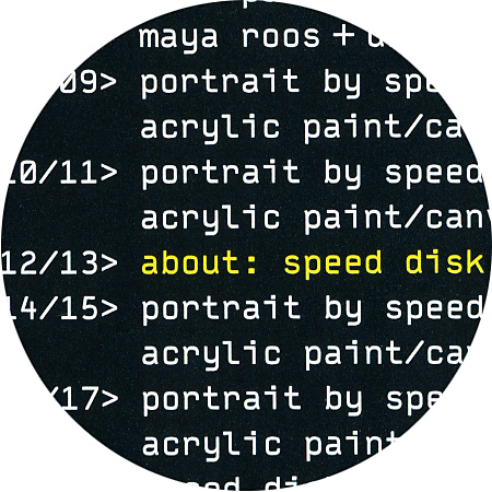
Typestar, detail from “Portraits by Speed Disk”
Typestar by Steffen Sauerteig (*1967).
Together with Kai Vermehr and Svend Smital, Steffen is running the design label eBoy.
Bell Antiqua, detail from «Meike Dölp – Vom Wolkigen»
The Bell antiqua is named after the English caster, printer, bookseller, publisher and journalist John Browne Bell (1745–1831). In 1766, he acquired the British Library, which became one of the most important lending libraries in London. The pages of his newspaper The Oracle were influential for many periodicals that followed. John Bell also founded the first illustrated fashion magazine in England La Belle Assemblée (a play on words on his own name). In 1788, he founded the British Letter Foundry with Richard Austin as punch cutter and engraver, to whom the Bell antiqua owes its appearance. It was considered a font innovation from the very beginning and was the first font in England from which the long “s” was banished.
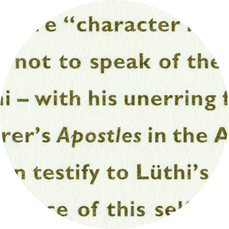
Gill Sans, detail from «Urs Lüthi – Art For A Better Life»
Gill Sans is a sans-serif linear antiqua font that was designed by Eric Gill (1882–1940) between 1928 and 1930. Gill Sans is based on Edward Johnstons’ font type Johnston Sans, which was co-designed by Gill. One characteristic is that the different font styles do not build on each other systematically, but have their own respective character. Italic fonts are only available in the font styles light and regular and some letters have a shape similar to handwriting, as is the case with the italics in antiqua fonts.
Ehrhardt, detail from «Urs Lüthi – Art For A Better Life»
The name Ehrhardt refers to the fact that this font derives from the normal and italic fonts of the leisurely Dutch styles that were contained in the Ehrhardt foundry’s type specimen book in Leipzig in the late 17th century. The font designer remains anonymous although some historians suspect it was the Hungarian punch-cutter Miklós Kis (1650–1702). Monotype recut Ehrhardt in the years 1937 until 1938.
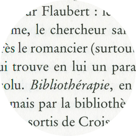
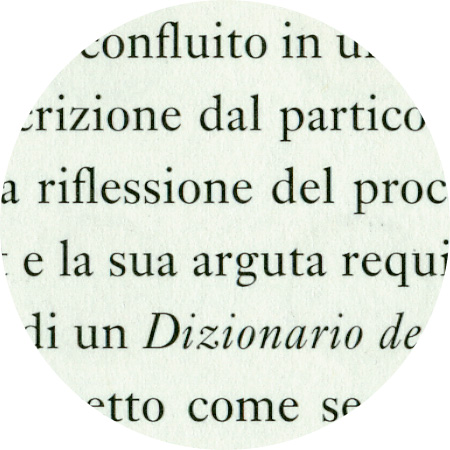
Stempel Garamond, detail from “Rémy Markowitsch – Bibliotherapy”
Garamond refers to a group of font types that have been used since the 16th century and which were created by Claude Garamond (1480-1561) or built upon them. Garamond shaped the antiqua and italic fonts so robustly that new alphabets with the same characters continued to appear well into the 17th century. At least within the German-speaking world, the Stempel Garamond has the reputation of being the truest Garamond to the original.
Mrs. Eaves, designed 1996 by Zuzana Licko (*1961). founder of the famous typefoundry Emigre. The typeface is named after Sarah Eaves, the woman who became John Baskerville's wife. As Baskerville was setting up his printing and type business, Mrs. Eaves moved in with him as a live-in housekeeper, eventually becoming his wife after the death of her first husband, Mr. Eaves. Like the widows of Caslon, Bodoni, and the daughters of Fournier, Sarah similarly completed the printing of the unfinished volumes that John Baskerville left upon his death.
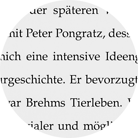
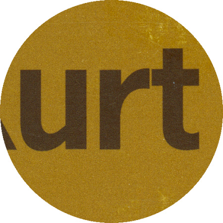
Palatino, detail from “Kurt Kocherscheidt”
Giovanbattista Palatino, after whom the Palatino typefaces are named, was a writing master of the 16th century in Rome. His work inspired the german type designer Hermann Zapf (1918–2015) although none of Hermann Zapf’s typefaces could be said to be literal revivals of Giovanbattista Palatino’s letters. Designed between 1948 and 1950, Palatino was first released as in lead type form by the German typefoundry D. Stempel AG in Frankfurt, and quickly became one of the world’s most popular typefaces. The original Palatino Roman and Italic punches were cut by hand by punchcutter August Rosenberger.
Franklin Gothic, detail from “Kurt Kocherscheidt”
Franklin Gothic and its related faces, are realist sans-serif typefaces originated by Morris Fuller Benton (1872–1948) in 1902. “Gothic” is an increasingly archaic term meaning sans-serif. Despite a period of eclipse in the 1930s, after the introduction of such European faces as Kabel and Futura, they were re-discovered by American designers in the 1940s and have remained popular ever since.