detail cover of “Hoehenrausch.2”
October 26th, 2010
Textured surface
This special cover surface was made by laminating the ofset printing with a textured transparent foil.
detail cover of “Hoehenrausch.2”
This special cover surface was made by laminating the ofset printing with a textured transparent foil.
Bureau Grotesque, detail of “Zeitschrift für Medienwissenschaft”
Bureau Grotesque reintroduces the tooth and character of the nineteenth-century sans. Developed in 1989 for Roger Black, The Tribune Companies, and Newsweek, the first Grotesques met with immediate success. Further weights were designed for Entertainment Weekly and Madrid daily El Sol a family of twelve fonts by 1993. David Berlow found his models in Stephenson Blake grotesques from the 1800s.
Janson text. The models for this font were originally credited to Anton Janson (1620-1687), a German punch-cutter working in Holland. Some font historians dispute this and credit the authorship to Nicholas Kis, a Hungarian punch-cutter. The original Janson antiqua first underwent a transformation into another composition style in the 1950s under Hermann Zapf. In 1985, Adrian Frutiger adapted Janson for Linotype.
Quadraat sans by Fred Smeijers, who established the design group Quadraat (in Arnhem). The name was also given to his first published typeface: FF Quadraat, launched in 1992. In 2004 Smeijers was appointed Professor of Digital Typography at the Hochschule für Grafik und Buchkunst, Leipzig.
Zeitschrift für Medienwissenschaft
Janson Text, detail from “Zeitschrift für Medienwissenschaft”
Janson Text, detail from “Max Wechsler - Augenzeugnis”
Janson text. The models for this font were originally credited to Anton Janson (1620-1687), a German punch-cutter working in Holland. Some font historians dispute this and credit the authorship to Nicholas Kis, a Hungarian punch-cutter. The original Janson antiqua first underwent a transformation into another composition style in the 1950s under Hermann Zapf. In 1985, Adrian Frutiger adapted Janson for Linotype.
Oranda, detail from “Celluloid”
Oranda was designed by the Dutch designer Gerard Unger as a custom project for the European printer manufacturer Océ, in 1987. “When I designed Oranda I had a look at typewriter fonts and came up with a subtler and more modern variant: narrower, more open, with tapered serifs and proportional spacing.” (G. Unger)
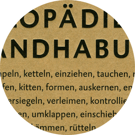
Caspari, detail cover of «Annette Rose – Enyklopädie …»
Caspari, detail from “What Is a Good Exhibition”
Caspari was started by Gerard Daniëls (* 1966) while he was still studying at the “Koninklijke Academie van Beeldende Kunsten” in the Hague, Netherlands. It was released in 1993 through Dutch Type Library. Caspari can be situated somewhere halfway between Gill Sans and Syntax, but its openess and simplicity lend it a typically Dutch quality. It also has beautifully shaped oldstyle figures and powerful real italics, which most sanserifs lacked at the time.
Haarlemmer, detail from «Annette Rose – Enzyklopädie…»
The “Vereeniging voor Druk- en Boekkunst” (Society for the Art of Printing & Books) invited Dutch type designer Jan van Krimpen (1892–1952) to design a new typeface for an edition of the Dutch Authorized Version of the Bible (Staten Bijbel) in 1938. The first trial sheets of Haarlemmer were pulled in June 1938. Further work on the design was done at the Monotype works in England during the early months of the war, but all plans for the Staten Bijbel were abandoned after the invasion of Holland. 60 years later, the Haarlemmer contours were subsequently given a face-lift by Frank E. Blokland (* 1959). The roman was revised especially thoroughly. Apart from weight and contrast, form and adjustment were considerably improved. The true qualities of the 1938 type design, which technical limitations and war had prevented from completion, are revealed now in DTL Haarlemmer.
Garamond CE, detail from “Ilze Orinska – Naturalia”
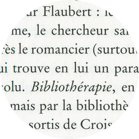
Stempel Garamond, detail from “Rémy Markowitsch – Bibliotherapy”
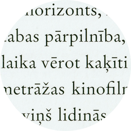
Latvian, set in Garamond CE.
Latvian is one of two living Baltic languages with an official status (the other being Lithuanian), a group of its own within the Indo-European language family.
Latvian in western orthography was first written using a system based upon German phonetic principles, while the Latgalian dialect was written using Polish orthographic principles. At the beginning of the 20th century, this was replaced by a more phonetically appropriate system, using a modified Latin alphabet.