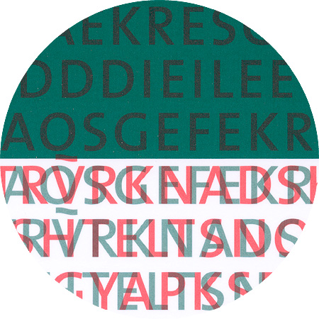
Lunatix, detail from «Die dritte Kammer»

December 9th, 2005

Lunatix

Lunatix, designed in 1988 by Zuzana Licko (* 1961). As the daughter of a bio-mathematician, she had access to computers from a young age and taught herself the basic principles of programming. She then began to develop her first fonts and her first alphabet was based on the Greek alphabet. She first studied Architecture, Information Technology and Photography and complete a diploma in Visual Communication at the University of California, Berkley. She subsequently collaborated on the development of post-font technology in Adobe Systems’ graphics department. At the beginning of the 80s, Licko founded the experimental type foundry Emigre with the Dutch graphic designer and Photographer Rudy VanderLans (the title was derived from the fact that both were so-called émigrés i.e. immigrants in the USA).

VAG Rounded, Detail from «Nic Hess – Guten Morgen Deutschland!»

June 16th, 2005

VAG Rounded

VAG Rounded was originally commissioned specifically by Volkswagen in 1978, who at the time had recently merged with Audi to form the “Volkswagen Audi Group” (VAG). GGK Düsseldorf was tasked with the branding concept. Volkswagen at the time had Futura as their typeface. Audi at the time used Times. The new typeface should not be sans serif as the Futura, and it should not be serif as the Times. A rounded typeface did not exist at the time; it had to be developed. The original idea was conceived by Wolf Rogosky (creative director) and Gerd Hiepler (art director). The original typeface was rendered by hand.

Since then, VAG Rounded has seen frequent use including on Apple keyboard products since 2007. In March 2015, Apple marked its first departure from VAG Rounded as a standard for its keyboards by using its own San Francisco typeface on their new MacBook models.

Goudy Catalogue, detail from «Nic Hess – 51 Views of Mount Matterhorn»

May 1th, 2005

Goudy Catalogue

Goudy Catalogue (Frederic W. Goudy, 1915). Frederic William Goudy (1865–1947) became familiar with William Morris' books and the press movement in his early years as a bookseller. In 1903 he founded Village Press. From 1920 to 1940 Goudy was the artistic director of the Lanston Monotype Company. Goudy developed over 100 fonts between 1899 and 1944.

TheSans Regular, detail from “Erwin Wurm – Glue your brain”

TheSans Regular, detail from “Max-Planck-Institute”

March 5th, 2005

Thesis (TheSans)

Thesis is a font superfamily that is essentially composed of four font variations: TheSans, TheSerif, TheMix and TheAntiqua. The original typesets were developed in 1994 by the Dutch designer Lucas de Groot. Since then, he has added to it with numerous font variations at regular intervals. Meanwhile this gigantic superfamiliy includes Cyrillic, Hebrew and even Arabic variants. Thesis became part of the LucasFonts type library in 2000.