American Typewriter, detail from “Die Ringe des Dieter Roth”

American Typewriter, Detail from “Nic Hess – Guten Morgen Deutschland!”

December 12th, 2006

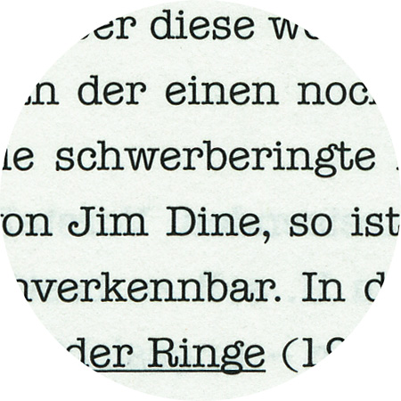
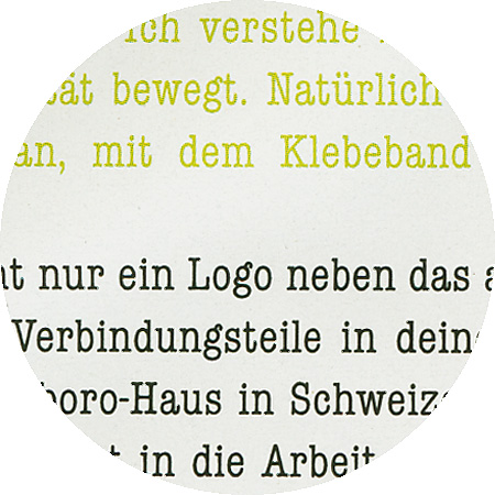
American Typewriter

Mechanical typewriters insert the same spacing in between all letters (monospaced). In contrast, the American Typewriter created by Joel Kadan in 1974 and commissioned by ITC has proportional spaces. It is a new interpretation of older mechanical typewriter models.
Incidentally, Mark Twain is said to have been the first to compose a complete manuscript on a typewriter: “The Adventures of Tom Sawyer” (the first edition appeared in 1876).


Plantin, Detail from “Paolo Parisi – Observatory”

Plantin, Detail aus «Special Models»

October 23th, 2006

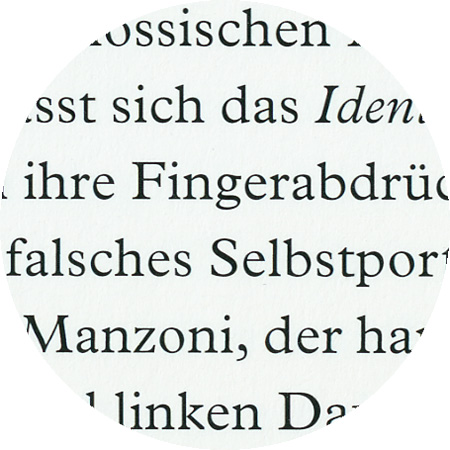
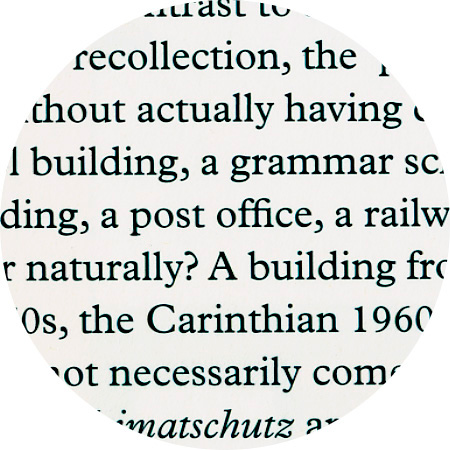
Plantin

Plantin was designed 1913 by Fritz Stelzer under the guidance of Frank Hinman Pierpont (1860–1937) for the Monotype Corporation. Pierpont is said to have been inspired to create the Plantin font by the font of a 1905 catalogue from the Plantin Moretus Museum. The name of the font refers to the publisher and printer from Antwerp, Christophe Plantin (1520–1598), who used it in 2450 publications over 34 years. Plantin is among the fonts that were created during the course of the neo-renaissance movement in Europe and America after the qualities of the renaissance antiqua were re-discovered around the middle of the 19th century. Plantin is one of the typefaces that influenced the creation of Times New Roman in the 1930s.

Univers Condensed, detail from «Paolo Parisi»

October 23th, 2006

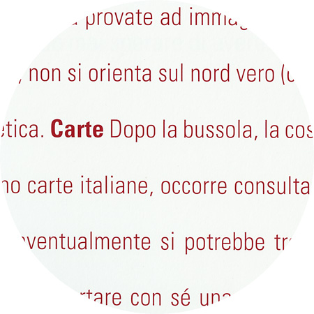
Univers

Univers is a sans-serif linear antiqua font, which was designed in 1950/1951 to 1956 by Adrian Frutiger and published by the type foundry Deberny & Peignot in 1957. Helvetica and Univers are probably among the most commonly used font types in so-called Swiss typography. Different thicknesses and character widths within the font family, which is made up of a total of 21 (later 27) font styles, are identified through a numbering system instead of by names. This is a system that Frutiger also later used for other font types.

Beton, Detail from “U2 Alexanderplatz”

Beton, Detail from “Max Wechsler, Augenzeugnis”

September 5th, 2006

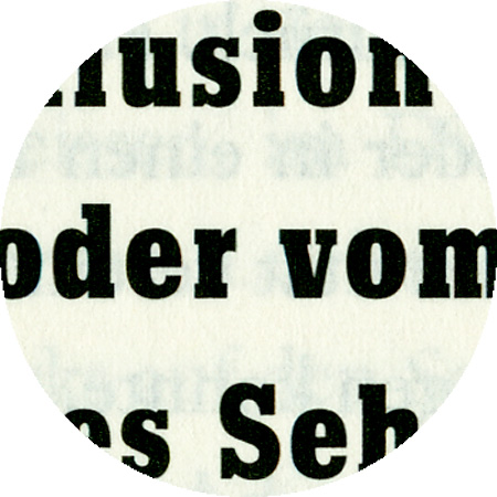
Beton

Beton Bold Condensed, created in 1931 by Heinrich Jost (1889–1949). Serif linear antiqua fonts first appeared at the beginning of the 19th century. In the 1930s, they belonged to the standard fonts. The first serif linear antiqua fonts were derivatives of text fonts similar to the Didot font (e.g. the Walbaum font). As newspapers and advertising became more and more important, type foundries and printing presses began cutting larger, bolder fonts that attracted the reader’s attention. This self-reinforcing phenomenon finally ended with monstrous letterpress wood types. At the beginning of the 20th century, typographers began taming and codifying the font styles of the 19th century.

Futura, detail from “U2 Alexanderplatz”

Futura, detail from «Nader Ahriman»

September 5th, 2006

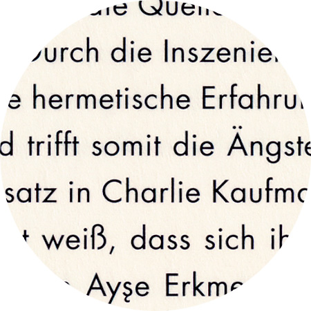
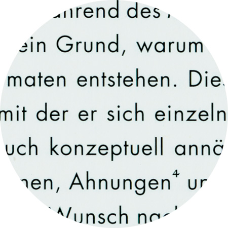
Futura

The Futura font, of which Paul Renner produced the first designs back in 1924, was strongly inspired by Bauhaus. Renner regarded it as overcoming the “incoherency of Roman tilting font and the Latin lower-case letters, which originated from the handwritten Carolingian Minuscule font”. His Futura font was the prototype for a geometrically-designed sans-serif linear antiqua font.