November 28th, 2008

Cooper

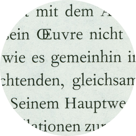
The 20-year old designer?s son Oswald B. Cooper took Frederic Goudy's writing course, among other things, at the Frank Holme School of Illustration in Chicago. In 1921, he designed a thick font with round serifs, which he published at Barnhart Brothers & Spindler in 1922. Cooper Black corresponded to the advertising spirit of those times: simple, friendly, powerful. It was so successful that Monotype ordered a copy, which was created by Cooper's teacher Goudy and released as Goudy Heavyface in 1925.

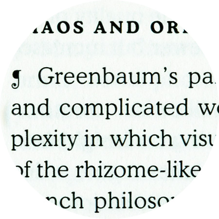
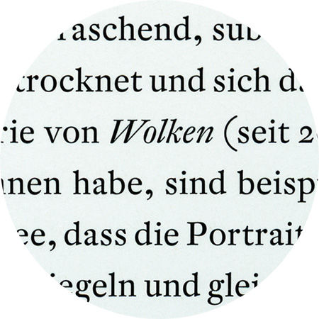
DTL Fleischmann, detail from «Britta Lumer»

November 9th, 2008

DTL Fleischmann

DTL Fleischmann was designed between 1993 and 1997 by the Leipzig-based font developer Erhard Kaiser (*1957) on commission by the Dutch Type Library. It is a new interpretation of a Barock-Antiqua and is based on historical font styles developed by by the punch-cutter Johann Michael Fleischmann (1707?1768) in the Netherlands in the second third of the 18th century.


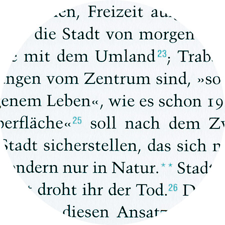
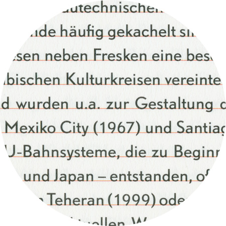
Trump Mediaeval, detail from “die stadt von morgen”

October 13th, 2008

Trump Mediaeval

Georg Trump (1896–1985) designed the Trump Mediaeval between 1954 und 1962. It is a fusion of characters from an Italian renaissance antiqua with calligraphic elements.

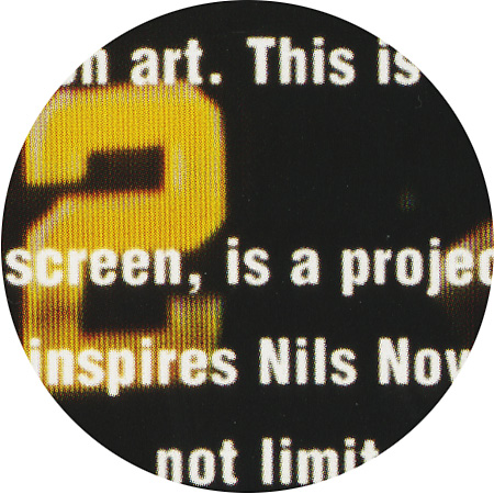
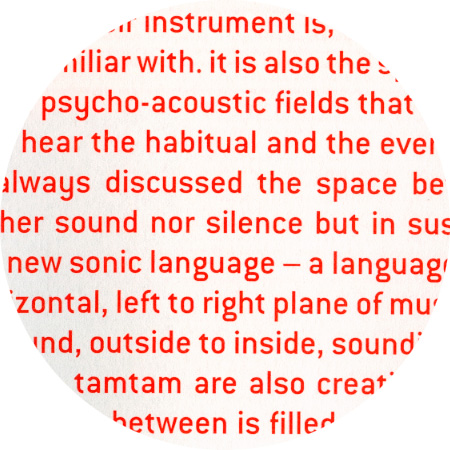
Helvetica Bold condensed, detail from «Nils Nova – Screen»

Helvetica bold (top), Helvetica condensed (bottom)

October 13th, 2008

Helvetica

The first Helvetica styles, which were also used in the exhibition of die stadt von morgen (“the city of tomorrow”) in 1957, were designed by the graphic designer Max Miedinger (1910–1980) in collaboration with Eduard Hoffmann. They used Akzidenz Grotesk by Berthold and Normal Grotesk by the company Haas as models. In 1957, the semi-bold Garnitur was released for the graphics trade fair ’57 for manual typesetting, firstly under the name Nils Nova – Screens

September 25th, 2008

ITC Conduit

ITC Conduit was created by Mark van Bronkhorst in 1997 based on “unprofessionally” painted shop signs. The shapes are similar to the perpendicular shapes of pipes, and Bronkhorst has rounded off the corners and edges.


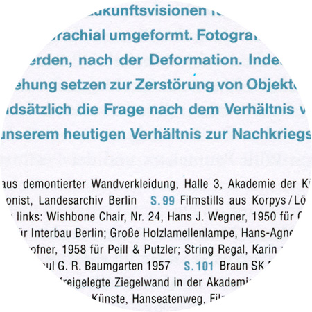
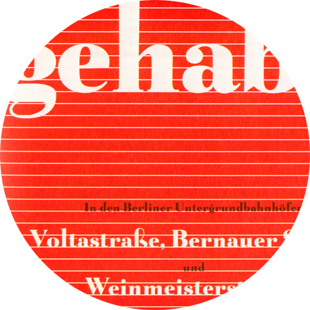
Belucian Ultra, detail from «Glück gehabt»

September 23th, 2008

Belucian

Belucian Ultra, originally designed as Lucian by Lucian Bernhard (1883–1972) in 1932, later later re-released as Belucian. Lucian Bernhard (born as Emil Kahn) designed posters, type, packaging, textiles, interiors and trademarks for a great many companies over the course of his career and his work was influential in both the United States and Europe; he emigrated from Berlin to America in 1923.

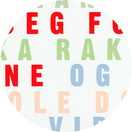
DTL Nobel, detail from «Glück gehabt»

September 23th, 2008

DTL Nobel

Nobel is a geometric sans-serif typeface designed by Sjoerd Henrik de Roos (1877–1962) and Dick Dooijes (1909–1998) in the period 1929–1935 for the Lettergieterij Amsterdam (Amsterdam Typefoundry). Begun just two years after the release of Futura, Nobel is a similar exploration of geometric form but allows far more biomorphic shapes and variation. It became one of the best selling sans-serif types of the Lettgieterij Amsterdam, continuing in popularity into the mid-1960s. Andrea Fuchs and Fred Smeijers of the Dutch Type Library produced a revival in 1993.

May 18th, 2008

Fournier (Monotype)

In 1924, Monotype based this face on types cut byPierre Simon Fournier circa 1742 and called “St Augustin Ordinaire” in Fournier’s “Manuel Typographique”. These types were some of the most influential designs of the eighteenth century, being among the earliest of the transitional style of typeface, and were a stepping stone to the more severe modern style made popular by Bodoni later in the century. They had more vertical stress than the old style types, greater contrast between thick and thin strokes and little or no bracketing on the serifs.