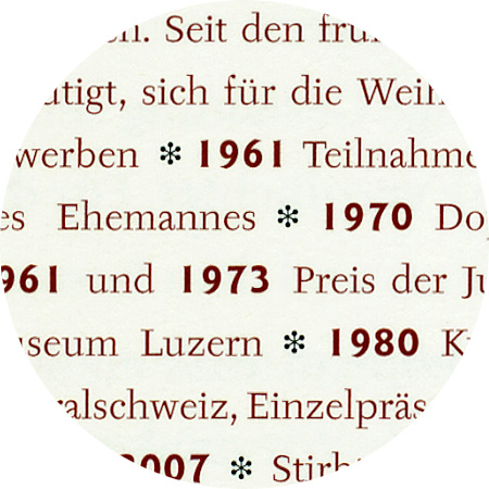
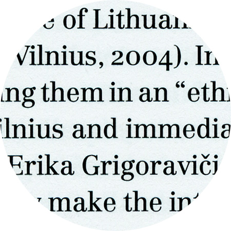
Centaur, detail from “Robin Rhode – Walk Off”

October 8th, 2007

Centaur

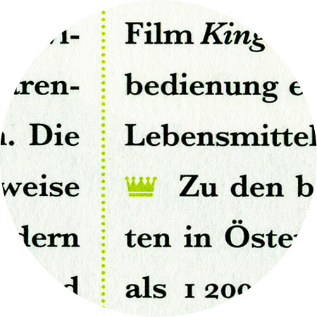
Centaur, originally designed by Bruce Rogers and Frederic Warde, 1914/1925). Bruce Rogers originally designed Centaur for the Metropolitan Museum in 1914. The italic font, which was later added by Frederic Warde in 1925, was originally called Arrighi. He drew these italics based on Ludovico Vicentino's Italika from the first half of the 16th century. The majuscules were designed from scratch.

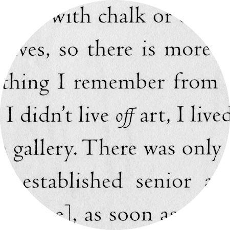
Baskerville, detail from «Schaurausch»

September 27th, 2007

Baskerville

Baskerville, which was originally developed by John Baskerville (1706–1775), was a technical milestone and an important reference for later classicists. Despite this, Caslon was often preferred at the time for aesthetic reasons, which is also recognised as the “English Antiqua” par excellence. There were already innumerable versions of Baskerville at the time of metal type.

Knightsbridge, detail from «Schaurausch»

September 27th, 2007

Knightsbridge

Knightsbridge, a robust and bold italic font, was created by Alan Meeks in 1975. This is a completely new interpretation of the alphabet that does not derive from any typographic or historical sources.

Tyfa, detail from “Josephine Troller”

Tyfa, detail from “Bittermann & Duka”

September 26th, 2007

Tyfa

Tyfa was designed as a hot type font in 1959 by Josef Týfa (1913–2007), who had a decisive influence on Czech corporate design in the 50s and 60s. From the mid-60s, he taught himself to design fonts. He named the Czech graphic designer Jaroslav Benda, modern graphic design and architecture of Pier Luigi Nervi as the main influences on his work. In 1995 another Czech type designer, Frantisek Storm, approached Tyfa and proposed digitizing the typeface under the elder designer’s direction. Tyfa agreed. To build Tyfa’s design into a family of digital fonts, Storm started with scanned images of the original drawings for metal type. Maintaining the personality and basic characteristics of the metal original was a primary objective for the two designers.

September 26th, 2007

Goudy sans

In designing Goudy Sans, Frederic W. Goudy (1865–1947) studied old lapidarian fonts and manuscripts. The font has these sources to thank for some of it special features: crescendo endings, accentuated serifs on some of the majuscules and alternative Unzial shapes. The first three cuts appeared in 1929.

Centennial, detail from «Don’t Worry, Be Curious!»

August 17th, 2007

Centennial

Linotype Centennial was designed by Adrian Frutiger and released in 1986 for the celebration of Linotype’s 100th anniversary. Frutiger was influenced by Century, a type designed by Linn Boyd Benton (1844–1932) and his son Morris F. Benton (1872–1948) for the American Type Founders Company at the end of the nineteenth century. Linotype Centennial is quite close in concept to Century, but it also has the characteristic Frutiger enhancements for contemporary elegance and legibility. It has a vertical stress, slightly condensed forms, a tall x-height, and fairly high contrast between thick and thin strokes.

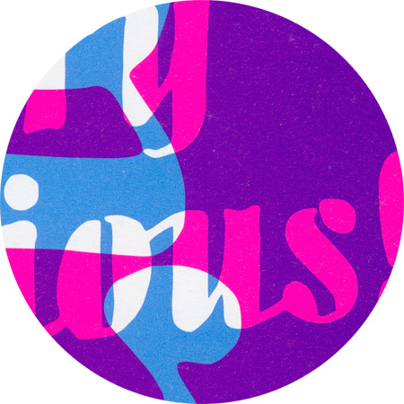
Detail from “Don’t Worry, be Curious!”

August 17th, 2007

Overprinting

Mixed tones are created through overprinting with customised colours – similar to the principle of acrylics – and without the use of a screen.