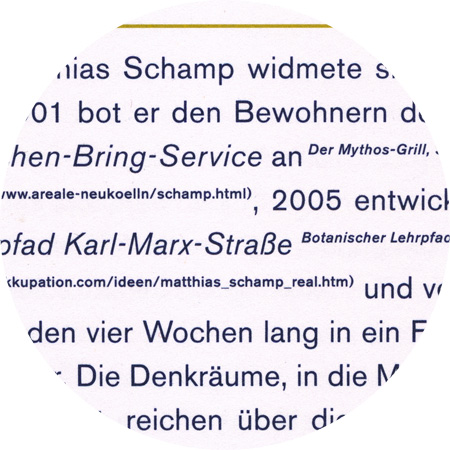
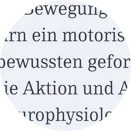
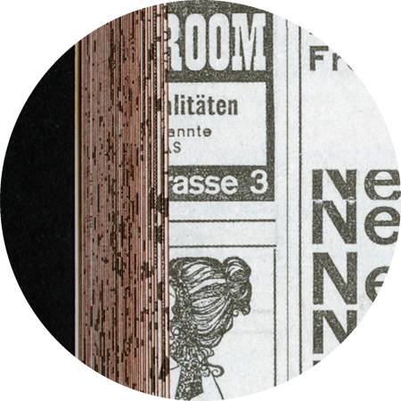
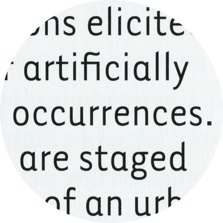
Akzidenz Grotesk, details from «space–thinks»

December 12th, 2009

Akzidenz Grotesk

“Accidenz” (sic) Grotesk was released by Berthold in Berlin in 1898, according to their own literature. It was obviously based on faces already offered by other foundries, some of which were later taken over by Berthold. One of the contemporaries of AG was Royal Grotesk from Theinhardt. In Berthold's specimen booklet no. 429, which was most likely released in 1954, Akzidenz Grotesk Mager (light) was still referred to as Royal Grotesk, in brackets. Berthold acquired a typeface in 1908, (when they bought Ferd. Theinhardt) which they released as space–thinks

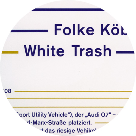
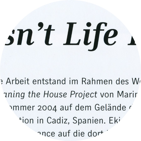
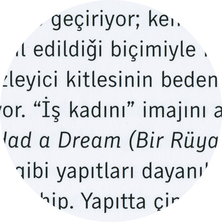
Skopex Serif and Gothic, detail from “Nezaket Ekici”

Skopex Gothic, detail from “Nezaket Ekici”

Skopex Gothic, detail from “Labyrinth–Freiheit”

Skopex Serif, detail from “Labyrinth–Freiheit”

December 12th, 2009

Skopex

Skopex designed by Andrea Tinnes is an extensive font family consisting of a gothic and a serif variant. Skopex Serif is a contemporary serifed typeface with a strong vertical nature and many playfull details. Skopex Serif matches the proportions of its gothic sister but has a strong contrast between thick and thin strokes. Characteristic features are the asymmetrical serifs as well as the slightly curved terminal strokes of R, K, k and y. The name “Skopex” comes from the ancient Greek verb skopein (see, view, sight, look at, examine) as well as the English noun scope (range, depth, breadth, reach).

November 11th, 2009

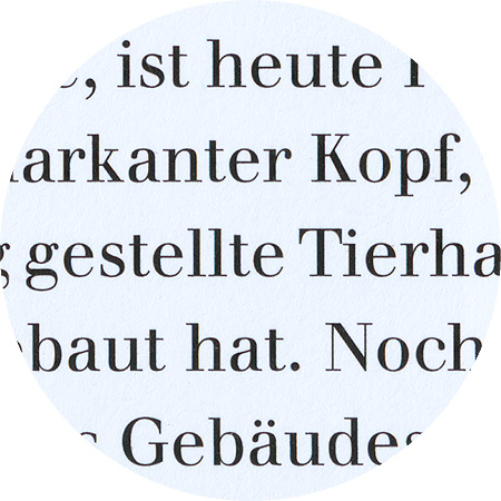
Walbaum

Walbaum was originally punchcut by Justus Erich Walbaum (1768–1837) in Weimar around 1800. It ranks with Bodoni and Didot as one of the great European “modern” style typefaces. Modern types represented the ultimate typographic development of the late eighteenth and early nineteenth centuries. They have characteristics quite different from the types that preceded them; such as extreme vertical stress and fine hairlines contrasted by bold main strokes.

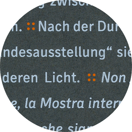
Tarzana narrow bold, detail from “Hoehenrausch”

Tarzana Narrow bold, detail from “Hoehenrausch.2”

November 4th, 2009

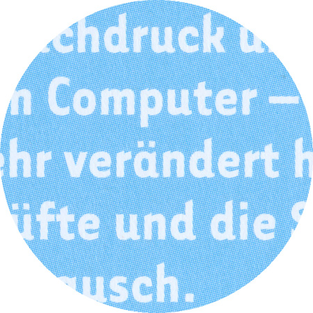
Tarzana

Tarzana Narrow Bold, designed 1998 by Zuzana Licko (co-founder of Emigre, together with Rudy VanderLans). The two families of sans-serif text faces were developed purely along formal lines. The goal was to balance the neutrality required for a text face with just enough idiosyncrasies to create a slightly unfamiliar design in order to provide new interest.