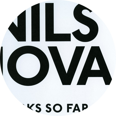
Docmenta Sans, details from “Eugen Schönebeck”
October 20th, 2011
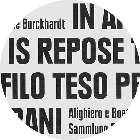
Documenta Sans
DTL Documenta Sans designed 1986–1993 by Frank E. Blokland (* 1959). Type designer and Senior Lecturer at the Royal Academy of Art in The Hague, Frank E. Blokland founded the Dutch Type Library in 1990, the first producer and publisher of digital typefaces in the Netherlands.