December 10th, 2013

Ludwig Pro

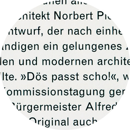
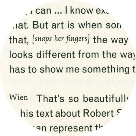
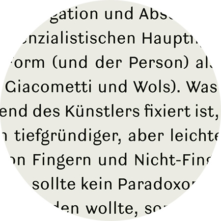
Ludwig, designed 2008 by Fred Smeijers. It belongs to the group of sanserif types known as 'grotesque', a name introduced in the 1830s when sanserifs began appearing regularly as printing types. Sanserifs were in general seen as blunt and inelegant, hence names like grotesque. It was the German typefounders who first produced sanserifs in sizes suitable for text, with fully matching upper and lowercase designs. OurType Ludwig is based on these first German sanserifs. But it is not a mere revival. It embodies Smeijers personal vision of how a early 19th-century sanserif design might look and perform today.

December 4th, 2013

Minion

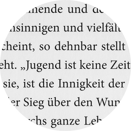
The basic model for Minion did not come from any one single source, but was a synthesis of historical forms and the digital possibilities of the 1980s. In the course of his research for the Adobe Garamond, Robert Slimbach collected a wealth of material on Renaissance typefaces from European museums. When Adobe began planning a new body text font, he brought the material out of his archive and gathered together all the usable ideas so that he could put a first draft down on paper. Adobe had just invented its Multiple Master technology, which enabled font users to generate custom fonts themselves without the need for drawing tools. Slimbach succeeded, using as few interpolation points as possible, in constructing the Minion characters. Minion Pro is an OpenType update of the original family, released in 2000.

Monotype Grotesque, detail from “Special Models”

Monotype Grotesque, detail from “Jakob Bill – Painting”

Monotype Grotesque, detail from “Dieter Roth – Tränenmeer”

February 8th, 2013

Monotype Grotesque

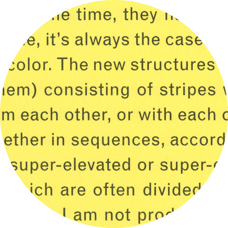
Monotype Grotesque, designed by Frank Hinman Pierpont (1860–1937) and published in 1926. The French term grotesque is etymologically derived from the Italian grottesco, which actually means “cave dwelling”. This referred to ancient paintings, characters and engravings that were discovered in caves and buried holes. Sans-serif fonts have been called Grotesk in Germany up until now. Monotype Grotesque is among the earliest sans-serifs cut for hot-metal machine typesetting, which was gaining widespread use in England in the 1960s. The typeface became popular in the 1950s and 60s owing to its availability on Monotype machines.